
This Wednesday is the one-year anniversary of the publication of a graph that should have brought down the Government.
On 29 September last year the Centre for Evidence-Based Medicine (part of Oxford University) published a figure showing the numbers of deaths from respiratory illnesses for every year from 2010 to 2020.
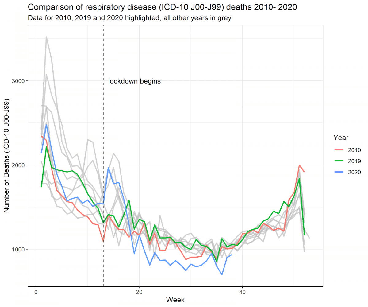
(Originally published by the Centre for Evidence Based Medicine, 29/9/2020: https://www.cebm.net/covid-19/summary-of-the-ons-report-on-deaths-registered-weekly-in-england-and-wales-29nd-september/)
You can see the 2020 graph shows a slight spike for April and May, but it is nothing unusual compared to the previous ten years.
Since Covid is a respiratory illness a Covid pandemic would have led to a massive spike in the numbers of respiratory deaths. 2020 should have been quite different to previous years. But the 2020 graph shows that 2020 was completely normal. There was no pandemic.
So where did the Government stats for Covid deaths come from? Simply, fraud. Tens of thousands of other deaths were classified as Covid deaths.
If we had proper journalists in the UK this would have been a massive story the following day. The Government would have fallen and prosecutions for fraud or maladministration would have followed. Profumo, Suez, Watergate, all these were nothing compared to the intentional destruction of a country’s economy and basic freedoms by its own Government.
And a year later it continues.
Sent to us by a reader.